Decolonizing Banania (Part II), the redesign
Re-designing Banania for the 21st century has been on my mind for a long time. If you wish to have a little background on the why I’m doing this, I kindly invite you to check out Part I of this article. It will give you the necessary background information as to why I’m doing this.
I don’t know anyone who works at Banania so I went ahead and just assumed a few things thanks to observation, common sense and experience. I don’t have any information about their real target market, their motivation, their pain points, what works, what doesn’t, etc. Usually I would ask a lot of questions so that I can design a real solution to a real life problem. But this is a conceptual project so let’s go!
My assumptions
The few things I assume are that, first, Banania is a breakfast brand that targets children (and their parents). My assumption is that the reason why Banania can’t let go of their current brand identity is because they desperately feel the need to have a mascot (I assume that this might be why they can’t seem to be able to let go of their current “mascot” and keep on coming back to it in spite of recurring outcry). As any breakfast brand targeting children, it’s a good idea to have a friendly face to represent your brand. So, when I approached this re-branding I decided that I, too, should create a mascot.
I also assume that they need a visual identity that is both warm and playful, something kids would like to see every morning (and something parents would like to buy).
My other guess is that they don’t want to lose the heritage they’ve built for over 100 years and that it is difficult for them to know what to keep and what to let go of (old brands are like that sometimes…).
Below you’ll find my attempt at responding to this self imposed brief while keeping in mind everything I just mentioned. Let’s see what I did…
Colours

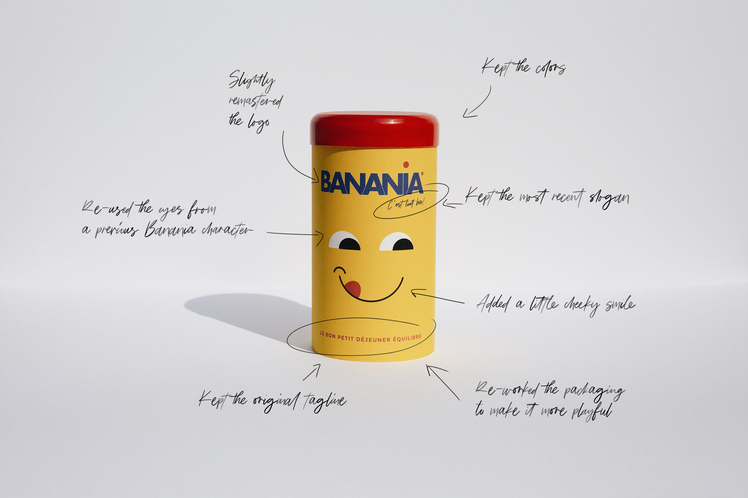
I kept the main colors of the original brand since I think they’re really what’s iconic about Banania. They work well together and they’re noticeable from afar.
Icon

For the mascot, I decided to work from this 1960s minimalist version of the Banania logo. I thought that the eyes were playful and, I could create something interesting with it. I didn’t want to use the other elements since they are, too, deeply rooted in the brand’s colonial past.

I also found that the packaging design they used throughout the 1980s and 1990s was a great starting point for the actual box and concept behind what I wanted to create.
By combining Banania’s original colors with elements from previous designs from the brand’s historical archive, I felt confident that I could create something that could work.

The result


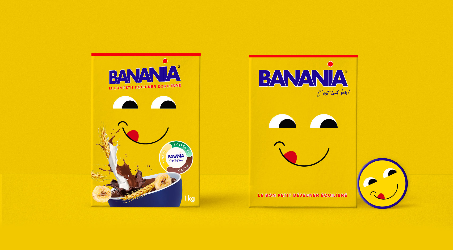
A minimalist playful icon with a bright smile reminescent of Banania’s previous visual identity without the racist elements. It goes to show that Banania already has all the elements to create a positive brand without reaching to its dark colonial past.
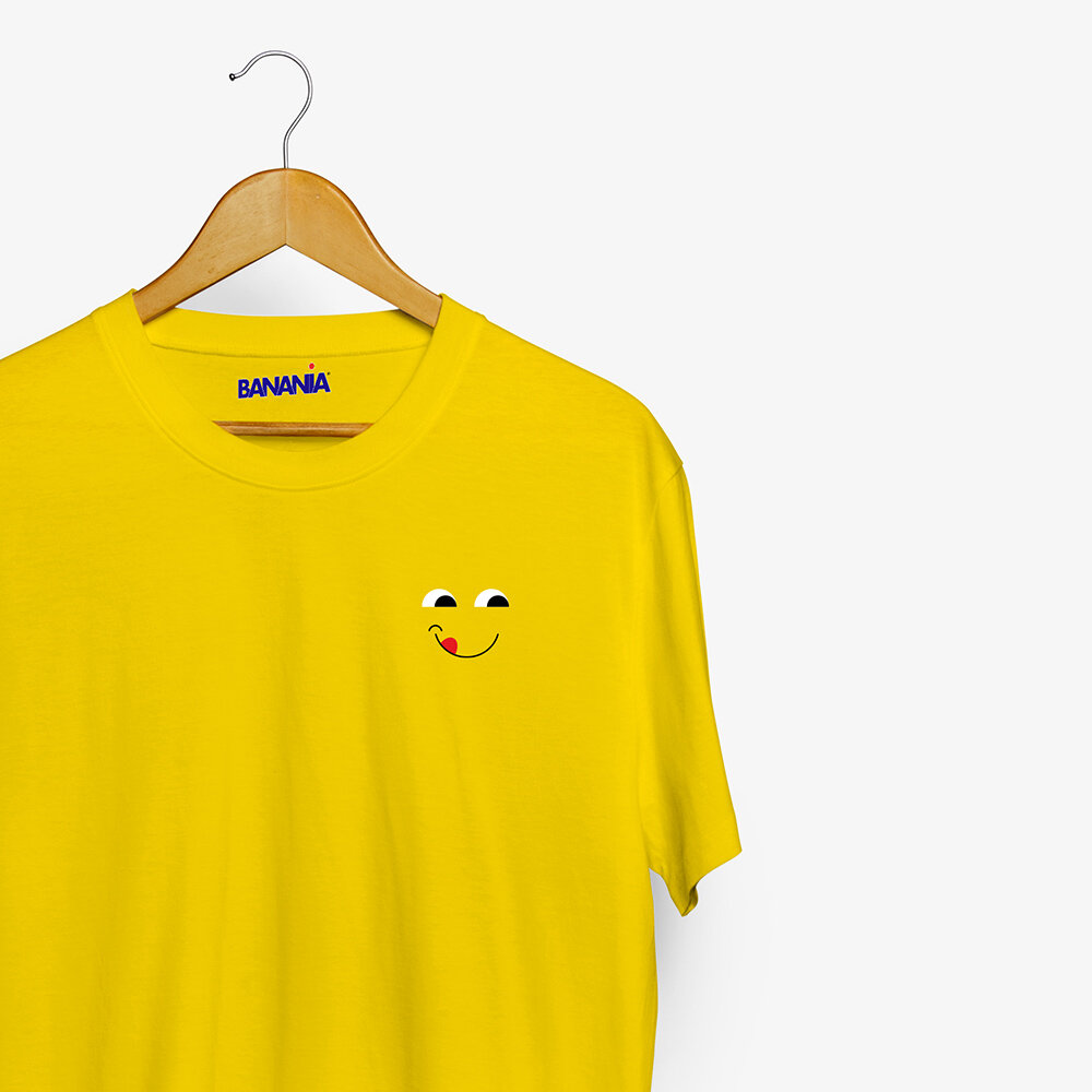
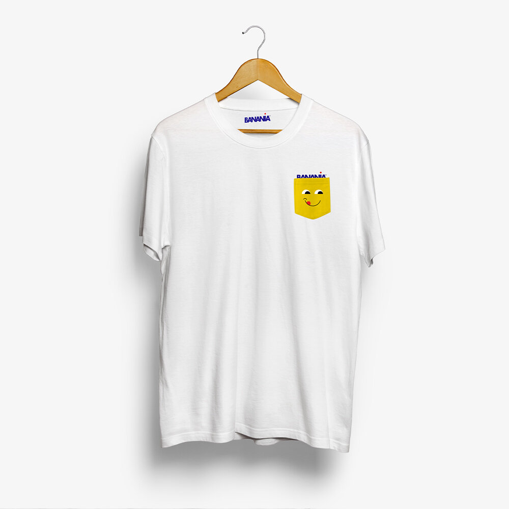
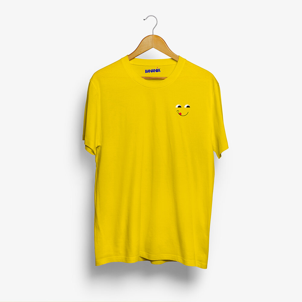
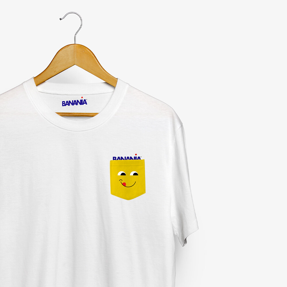
There’s room for playful goodies like t-shirts, badges, tote bags and anything you can think of that could use some eyes on it :)
A little Behind The Scenes


So what do you think? Is this enough? Did I overlook something? I would love to know your opinion.
And if you’re a designer, I would actually love to see what would be your solution to re-designing this brand.